Marissa Mayer Stole My Pen!

Written by Scott C. Montgomery, Partner at Bradley and Montgomery

Once upon a time, we held the keys to the tools of the design process. No more.

Last month, after 30 days of typeface selections disguised as possible new corporate identity options, recently-installed Yahoo CEO Marissa Mayer unveiled a final, new “logo” – complete with a video that pretended to show how it was all carefully drawn up with elaborate splines and vectors, and explained in a tidy Tumblr post about how fun the whole process had been.

To most people on the planet it was merely a passing news item, but within the graphic design community you’d have thought we’d each been personally Fedexed a ripe skunk covered with Super77: a squirming, odor-spewing of ball furry offensiveness we were simply unable to let go of. Comments sections of design blogs exploded with contempt. Erstwhile mild-mannered design purveyors swore like sailors. Typographers threatened to put out their own eyes. It created a minor (and industry-specific) social media maelstrom.
So let's put aside, for the moment, the fact that it's awful.  It is.

Let's also put aside for the moment, the fact that the "video" appears to take credit for Hermann Zapf's half-century-old typographic decisions. Yes, that’s despicable.
Our industry did die a little bit that day, but for another reason, and not because someone did a lazy logo. Lazy logos alone don’t kill the design industry or we’d all be on display with the stegosaurs by now. Nor does it kill the companies that use them – the Google corporate ID is just as embarrassingly slapdash as Yahoo’s – bevels, clown colors and all. Yet Google’s brand is among the strongest on the planet. Tech is rife with visual dreck, and yet the money flows in unabated. But most of the time, at least you could blame one of us for the awfulness. If it were dreck, at least it was our dreck.

Mayer's post on the birth of Yahoo’s new ID is something new and different and potentially much scarier. At first blush, it’s just a cute, chirpy note about her “process” – “playing around” with Adobe Illustrator over a weekend and polling employees about serifs. But what it really says is, “Logos are just type. Anyone with a computer can do this. It's fun. Designers just cost us a lot of time and money.”
Ladies and gentlemen of the design industry, Welcome To The DIY Era.

And it’s not just Yahoo, either. This is a whole new breed of client we’re dealing with, whose marketing degrees were earned with the completion of mock campaigns that did not include even mock designers. Their campaign theses were DIY’d, comps and all. Newly graduated, now they make real decisions for real brands. At my agency, we’ve seen it firsthand.
For example, a new, young contact at a tech client, a company we’ve worked with for half a decade, suddenly presented us with his own layouts for an ad – to run in front of our design peers in an advertising publication. And he ran them. And they were not good.

Then, a Fortune 10 client of ours told us, in a completely separate event, “guys, if we have enough information to put a brief together, we'll simply do the work ourselves – this is now encouraged here, across the organization, across lines of business.”
Later the same week, one of our sister company’s very bright research employees surprised me with a general knowledge of CS5 – he’d had a class in college called something like, “Visualization for Marketing Presentations 101” where he’d gotten an overview of and a smidgen of training in the graphing and typographic tools in Adobe Illustrator 5.5, and, therefore, the permission to use them in public. From a design perspective, that's like being partly trained to use an assault rifle.

Who let this happen? What amendment put such powerful weapons in the hands of the gloriously ill-suited?
Well… it’s mostly our fault. Let’s face it. If our only raison d’etre is access to the “mystery” that is design software, we deserve the turmoil we get. The “crisis” the Macintosh wrought upon professional typesetters in the early 1990s, professional color separators in the mid 1990s and TV creators in the late 1990s, now threatens us. Consider our collective petard hoisted.

We used to hold the means of production hostage and, for access to those tools, clients had to hire us. Now they don’t. Not for logos. Not for collateral. Not for video. Because we’ve held these keys to the technical toolshed for so long, we’ve gotten a little lazy ourselves.
In a lot of cases, we’ve gotten bad at delivering work quickly enough, proving its potential effectiveness, explaining the value of craft and championing the cultural effects of design. So bad, that client-side marketers – or, now apparently, even c-suite execs – increasingly buy that Adobe Suite and take matters into their own hands. This is the new reality.

Why? Is it really because it’s fun to see your words look a little like real typography at the tug of a pulldown menu? Maybe.


But if you ask them, it’s more that clients don't like working with some of us on a lot of days. On a lot of days, the Professional Design Industry comes off, to them, as a bunch of time-wasting, overpaid crybabies; we're not seen as data-driven. We're often inarticulate artists who make aesthetically pleasing but strategically questionable decisions. Some of us don't charge enough to command respect, while others charge laughable amounts for things like (just to pick on one) Arnell’sTropicana rebrand that required immediate undoing, or their ridiculously expansive Pepsi logo exploration book, which made our entire industry look like sucker's game.
I’ve been at this job since Miami Vice was considered a design touchstone and more than at any other time in my career, we’ve had to constantly prove and re-prove the value of the profession.

If we can't make Adobe remotely disable their client-side copies of CS6 (can we?), what do we do? We have to be everything our clients think we're not: More collaborative. More articulate about things that matter. And much more willing to deliver work on a schedule that's in sync with the demands of business.
One of our largest clients was kind enough to tell us outright: “We don’t need you to execute briefs. We need your unique insight, your speed, your strategy, your executional chops and your innovations. We need you (only) to be what we can’t be ourselves.”

Which, if you think about it, is what we all should want out of life, right?  
It’s really never been that our agency owns 45 Photoshop licenses, or that our art directors know how to change Illustrator’s kerning increments. More than ever, the software is as available as hammers at Home Depot. As an industry we have to remember, in times like these, that it’s not that we can build, it’s what we can build.
__


Scott C. Montgomery is a Partner at Bradley and Montgomery (BaM), an independent creative agency located in Santa Monica, Indianapolis and New York City. Because they deliver innovative, difficult and sometimes unusual projects to completion on accelerated schedules, they’ve been called “an agency with a sense of urgency.” They reside on the web at bamideas.com .

What's Behind Rising Paper Prices? And How to Prepare for Future Increases

Written by Travis Mlakar, President, The Millcraft Paper Company
 
This past month has seen price increases from every major paper supplier. Why?  The short answer - because they have to.

Over the past few months, we have seen unprecedented changes in the industry.  These changes, which culminated with International Paper closing one of the largest and most cost competitive mills in North America, are being driven by the fact that paper prices have been, and remain, too low for manufacturers to survive.

In order for this industry to stay competitive, we need to have healthy manufacturers, distributors and printers. We must find ways to promote the ROI of print as compared to other media choices (for help on that just look at NewPage's "Ed" series or "Print &" from Sappi).

So what can we expect in the future? We will see capacity continue to be taken out of the market in order to match demand. The reality is that the low prices the industry has maintained no longer make it cost effective to stay put in a situation where we have over capacity. IP's recent closure of nearly one million tons annually should be a wake up call to everyone in the industry.

It is time to select partners and support them. We can no longer expect the industry to "be there" when we move business around, back and forth from one supplier to another.  The lowest transaction cost may actually be the highest cost in the long run as our choices of supply may lead us into situations where we no longer have a choice - at any price. Now is the time to align yourself strategically with those players who will be there in the long term.  Work on programs that take volatility out of the equation.

In fact, if you look at PIA’s recent Financial Ratio Study that compares profit leaders in the industry to all firms, it further supports this approach. 


The profit leaders in the industry actually pay more, as a percentage of sales, for their paper than “all firms.”  The difference however, is that they get more productivity out of their people.  The question that people need to ask is "how much can I possibly save on paper vs. the cost of quoting it out each day to multiple suppliers and going through the hassle of “switching” suppliers from job to job, day to day?  What is the cost benefit when you factor in receiving multiple deliveries, handling multiple invoices, interacting with multiple suppliers and having to adjust equipment for varying stocks?

As we move forward, look for availability to get pushed out (longer lead times) and prices to increase.  In order to combat this, industry participants must find out what their "volume" can earn them - not by shopping it out, but by committing it. Work with suppliers to commit your volume for smoother pricing and better availability - don't "work" suppliers for a better cost. The players in the future who will thrive in this tight market will be those who don't work on a transaction basis but rather focus on setting up steady, consistent programs that allow them to work on running their business efficiently.

Battle of the Search Engine Logo Re-Design

It looks like this month is shaping up to be the battle of the search engines and their logo re-designs. Earlier this month we posted on Yahoo's re-design and readers were not shy about sharing their thoughts on that subject. Well now it's Microsoft's turn with the re-branding of their search engine Bing.

I have to say Bing comes out swinging - and in my opinion, its a KO in the first round. Scott Erickson, Senior Director, Brand and Creative shares some insight on the project in a recent blog post. "A new visual identity doesn't just happen overnight. We spent months looking at ways to update the look of Bing to represent what the product offers today, while achieving visual parity with Microsoft’s over-arching new look for the company. We worked with product, graphic and user experience designers to create a look that matches and grows with the product."

Call me crazy but this seems to be calling out Yahoo CEO Marissa Mayer and her post on bringing a new logo to life in a weekend brainstorming session with her design team and intern.

Let me be clear, I am not a branding expert - I leave that to the professionals. However, it does seem apparent to me that Mr. Erickson's approach was considerably more thoughtful and integrated.  The logo redesign set out to reflect the evolution of Bing from a mere search engine to a psychic magic eight ball - "delivering answers as users need them, via the products used every day even before users ask the question and improving the user experience."

They gave careful consideration to a logo that would reflect who they are today while blending well with Microsoft's new look. They reflected on their parent company's new identity, studying motion, font, color, size and form - settling on a look they deemed "simple, real and direct."  I have to say I think they have achieved that.


bing.com


bing.com


The font is a customized version for Segoe - keeping the lowercase "b" as a nod to their past logo. The kerning was closely studied to give the logo some unity with the Windows mark. The color, while reminiscent of the previous Bing orange, is a bit more current and connects well with the palette in the flag of the Microsoft logo.

bing.com

bing.com


To me this is so very different in every way to the process employed by Yahoo for its redesign. Clearly the new Bing identity is poised to weather the evolution of the brand and more importantly, I believe, accomplishes what Bing set out to provide its users with - clarity and insight. I say job well done to Mr. Erickson and his team, but in the end I am still a Google loving girl.

Ya-Who? Creatives Weigh In on Yahoo Logo Redesign

Last week we posted about the recent logo redesign by Yahoo, and CEO Marissa Mayer's thought process behind it. I have to say she really struck a chord with the creative community. If the commentary in our LinkedIn groups is indication, the redesign is an epic fail among designers.  Here's what a few had to say:

"I kinda miss those funky over sized serifs, after all the name "Yahoo" sounds so Americana Hillbilly--especially with the yodel vocals they've employed in the animated roll out of the new logo. The brand feels benign and slick--but memorable?"

"They put more thought, energy, intelligence and creativity in the video announcing the logo than the logo itself. To re-brand is to re-think and re-engage the relationship with your audience, not just a logo change. They googleified their homepage and now corporatified their logo. Who are you Yahoo? Stop trying to be Buzz Lightyear and get back to being Woody!!! Yahoooooooo!!!!"

"Conceptually it's confusing. Aesthetically it's junk. My two cents."

"What confounds me is how a multi-billion dollar company would want a "brand refresh" and focus on the logo alone. True experts know that the visual representation of a brand is the reflection of brand strategy development and so much more. Without knowing their (new?) brand strategy, how could anyone possibly evaluate the logo design as it relates to whether it works or not? I also agree that it's a slap in the face the way they went about it internally - and then to "crowd source" for the actual winner...???"

"Let's put aside for a moment the fact that it's awful. It is. Let's also put aside for the moment, the fact that the video appears to take credit for Hermann Zapf's half-century-old typographic decisions. Yes, it's despicable. Our industry died a little bit last week. Mayer's Tumblr post speaks volumes about their (her) "process" of playing with Illustrator and polling employees about serifs. I submit to this forum that this is mostly our (designers) fault: Welcome to the DIY era."

"Unbelievably amateurish."

"The answers, with this logo and it's tired Optima font and poor kerning, are no more memorable, than a company from the 90's that reminds us of GeoCities, Earthlink and Alta Vista".

You can read all of the commentary in the discussions on the Communcation Arts group on LinkedIn.

The Maker Movement and The Declaration of Craft

Written by Jill DiNicolantonio

It's no secret we're fans of independent, local businesses, so the idea of an entire movement dedicated to craft is one we can definitely get behind (after all it's part of our heritage - just look at our name). Unless you've been living under a rock for the past year, you've no doubt heard of the Maker Movement. The movement affords DIYers the opportunity to turn their hobbies into careers.  With small scale manufacturing becoming accessible via new technologies like 3-D printing, and sites like Kickstarter making it easier for wantrepreneurs to get funding - The Makers Movement has taken off.  And I for one could not be happier about it. 

Since 1920, Millcraft has been dedicated to making quality crafted papers and substrates available for all. While our offering has grown to 1000+ papers, we still offer (and stock in our warehouses) the first line available in our portfolio - Strathmore. Today Strathmore is made by our friends at Mohawk, a company inspired by the very ideals of today's Maker Movement: "high-quality materials, time-tested methods, ingenuity and careful execution." To demonstrate their commitment to these ideals, Mohawk has launched a fab new campaign that celebrates craft in a digital world.


The campaign consists of three new publications which "feature the stories of printers, designers, manufacturers, artists, artisans, musicians, and all those who make their living as makers." The Mohawk Declaration of Craft, The Mohawk Craft Cooperative, and The Mohawk Maker Quarterly publications promote and underscore the importance of craftsmanship and collaboration in a digital era. In addition Mohawk's partnering with Martha Stewart Living Omnimedia as Supporting Sponsor of the 2013 Martha Stewart American Made program and awards ceremony. Not only am I huge fan of Martha's but a few of Millcraft's customers are in the running - now that's kind of cool, or as Martha would say, that's a good thing.

MOHAWKCONNECTS.COM
All I can say is W O W. When I got my samples I flipped through each one, feeling that craftsmanship in the sheet and smelling the ink on paper (come on, you know you do the same thing).  Designed by Hybrid Design, The Declaration of Craft is produced on Mohawk Superfine Ultrawhite 80# Cover Eggshell. This piece really pushes the boundaries when it comes to printing on fine uncoated papers.  Fans of print will swoon - featuring blind embossing, foil stamping and perfect binding techniques, it begs you to peek inside.
 
MOHAWKCONNECTS.COM
Upon opening the cover, I was blown away by the ink coverage - solids done with two hits of match metallic pewter, duotones with metallic pewter and black. W O W. I love that they used a french fold to help bulk up the piece and inserted half pages in process yellow, match light blue, teal, green, orange, pink and black, a nice way to emphasize the copy without detracting from the beauty of the duotone photography. The piece flows nicely beginning with basic tenets of the modern Maker Movement, then detailing the heritage, beliefs, and innovations of Mohawk since its inception in 1931.

MOHAWKCONNECTS.COM
In addition, The Mohawk Maker Quarterly is Mohawk's commitment to sharing "the art of craft" with its community. Printed on Superfine Ultrawhite 80# Text Eggshell, the piece is in tabloid format - again designed by Hybrid Design. The first issue begins with a Letter From the Editor, as well as features on Craft 2.0, The Story of Superfine, Luxe Business Cards, and Massimo Vignelli. I especially enjoyed the spread on "The Movement," profiling twelve "Champions of Craft" and their wares - its so inspiring to see all the different types of innovations the movement is spawning.

The other notable point is throughout the pieces, Mohawk has incorporated the element of augmented reality, inserting the an image that enables the Mohawk Live App (available for iOS and Android) to bring the piece to life - integrating print with digital and transforming a one dimensional image into a multidimensional experience.

Yahoo Logo Redesign Unveiled

Written by Jill DiNicolantonio
 
About a month ago, Yahoo launched it's new logo project "30 Days of Change." The premise being it would unveil a new logo each day on it's homepage throughout the U.S. network. "It's our way of having some fun while honoring the legacy of our present logo," Yahoo said.


The project has now featured all 30 logos, the most recent being unveiled today and is the "official" new logo for the company. The official logo was not one of the previous 29 that was featured.  I am not sure I get the purpose of featuring 29 different logos before unveiling the official one - I mean everyone has an opinion and inevitably you are going to hear about why the one selected isn't as good as a previously featured one. I'm just not a fan of second guessing. I suppose it gets people talking about the brand - and after all isn't that the whole point?

In her recent blog post, CEO Marissa Mayer explains her thoughts on whole process.  Here's the Cliff's Notes version:
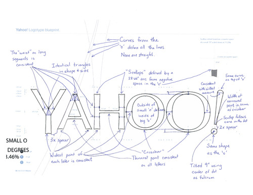
  • "We knew we wanted a logo that reflected Yahoo—whimsical, yet sophisticated. Modern and fresh, with a nod to our history. Having a human touch, personal. Proud." 
  • "We didn't want to have any straight lines in the logo. Straight lines don’t exist in the human form and are extremely rare in nature, so the human touch in the logo is that all the lines and forms all have at least a slight curve."      
  • "We preferred letters that had thicker and thinner strokes - conveying the subjective and editorial nature of some of what we do."      
  • "Serifs were a big part of our old logo. It felt wrong to give them up altogether so we went for a sans serif font with 'scallops' on the ends of the letters."      
  • "Our existing logo felt like the iconic Yahoo yodel. We wanted to preserve that and do something playful with the OO’s."      
  • "We wanted there to be a mathematical consistency to the logo, really pulling it together into one coherent mark."      
  • "We toyed with lowercase and sentence case letters. But, in the end, we felt the logo was most readable when it was all uppercase, especially on small screens."
  • "Our last move was to tilt the exclamation point by 9 degrees, just to add a bit of whimsy."

Anthem Plus - The New American Workhorse

Written by Jill DiNicolantonio

The folks at NewPage are at it again.  A year after shifting the way we think about coated paper with the launch of Sterling Premium (check out our review here), they're looking to revolutionize the way we think about coated economy papers with the introduction of Anthem Plus. Touting it as a "simpler, broader, better offering," NewPage is focusing on it's American Made heritage with the launch of the grade while challenging the status quo with the way companies look at environmental considerations.

The basics: 90 Bright, Blue-white shade, which is a nice bonus in the economy tier offering.  Available in Gloss, Dull and Matte finishes with basis weights ranging from 60# text to 110# cover. It's packed in cartons or press-ready mini skids sure to make pressmen across the country jump for joy at the thought of not having to unwrap another package before loading onto the press. Sporting the mark of responsible forestry certification with your choice of FSC, SFI or PEFC certification available - FYI Millcraft is stocking the FSC certified products. Also worth mentioning is the fact it is a perfect shade match to their digital product offering, Blazer Digital, in the economy category as well - making cross platform output quality appear seamless in its transition.


Enough about the pedigree of white coated paper - what really got me excited about this grade was how NewPage is positioning it. When I laid my eyes on the print promotion for the launch (designed by Froeter Design Company who also did the work for the Sterling Premium launch), I started to get excited. Finally a major domestic mill is embracing it's roots.  Flipping through the piece, The New American Workhorse, you'll find beautiful photography evoking images of Americana. From the corn fields of Ohio (after all NewPage is headquartered in the Buckeye state), to the lone biker on the open desert road (printed sepia tone for added emo effect), to the classic Weber Charcoal grill with smoke billowing from it's top, to the smiling faces of the Harlem Engine Co.90, FDNY - this piece is brimming with American pride. I also think it's very smart on NewPage's part to key in on the very hot maker's movement sweeping the country, which at it's heart is about the re-emergence of the American spirit of tinkering and building, re-tooled and made user friendly for today's market.

The other part of this launch which I find extremely interesting is the emphasis NewPage is putting on shifting the environmental conversation away from slapping a logo on everything print just so a company has CYA'd itself with the consumer, and got down to walking the walk by really following the practices of sustainability.  The biggest point that stood out to me when I sat through the sales meeting was the fact that this grade, while sporting important Chain of Custody certification, contains no post consumer waste.  This is a big departure for a major coated paper manufacturer. 

Let's be honest, while it's easy for the consumer to understand the recycled logo followed by the words "contains X% PCW", what does it really mean in terms of the integrity of the brand's sustainability efforts? Let me explain, a lot of commercial printing papers sold here in the U.S. are made overseas.  How environmentally responsible is it for an American company to sport the recycled logo on it's catalog, when the paper used to print the catalog comes from Asia and has traveled over 7,000 miles via container + 2400 miles via regional air freight + 1200 miles via freight rail + 500 miles via LTL (mill domestic D.C.) + 100 miles via small truck (local merchant) +  50 miles via van (printer) to get to the fulfillment center? One could argue the benefit of 10% PCW pales in comparison to the detrimental environmental effects of 8,000 lbs.of CO2 emissions - which is the case in the aforementioned scenario.

Let's be clear, if you can find a domestic paper that contains PCW - which NewPage offers in their Sterling Premium grade - that would be optimal.  But if you are like many these days, budget is dictating your paper purchase - hence the need for an economy sheet with all the aesthetics you want (finish, weight, brightness, shade) plus a responsible carbon footprint - that's where Anthem Plus changes the game, and why NewPage is positioning it as the smarter economy grade.

I applaud NewPage's stance on focusing on carbon footprint instead of PCW. I truly believe it's about time we all start walking the walk in terms of what it means to be an American company committed to practicing sustainability - which Merriam Webster defines as "of, relating to, or being a method of harvesting or using a resource so that the resource is not depleted or permanently damaged."

To request your copy of Anthem Plus, the New American Workhorse - click here. You can place your order for the new Anthem Plus on mymillcraft.com - don't have an account?  Sign up here.

Enve Meets Lope - A Love Affair

Written by Jill DiNicolantonio

Young Enve and Lope meet as friends in class, exchanging doodles and notes of affection. The relationship grows through time and is strengthened by a shared love of poetry, music, design, European travel, and, of course, love notes. The culmination of the story – marriage.


This fun promotion from Mohawk highlights eight styles of Mohawk envelopes ranging from square, A2, A6, A7, A9, A10, Monarch and Baronial. Some designs feature windows, others feature unique flaps, and our fave the new Euroflap design


The promotional concept and design was developed by Katie Barcelona, of Room 207 Design, and illustrated by Erik Marinovich, a letterist and designer based in San Francisco. Request your copy of Enve Meets Lope from Millcraft.


Survey Finds Designers Value Print

Written by Jill DiNicolantonio

Graphic Design USA has published the results of it's annual Print Design Survey.  This year being it's 50th time the publication has surveyed graphic designers, they focused on questions such as to what degree are designers working in print, how do you feel about print and paper and what role will print and paper have in the future of graphic communications.  The message was clear, "humans like to touch and print is the ultimate tangible medium. On that basis alone, the present of print is meaningful and the future promising."


While I don't think anyone will be shocked by the overall findings, the comments tell a more complete picture:
 
"In some ways, print has become more meaningful because it is more rare. A direct mail piece can actually get more traction than an HTML email because there is less clutter surrounding it. That
being said, print without value to the receiver is seen as wasteful. Care must be taken to make sure any printed piece is worth it."

"Print is still very much “in your face,” more so than its digital counterparts. With things like posters, brochures, magazines, invitations, catalogs, books and business cards, the tactile aspect of the paper and the printing techniques definitely play an important role in the overall experience of the viewer. The impact is completely different, more visceral. I dare say that the printed word still carries more weight than the digital one."

Read the complete survey and its findings on Graphic Design USA. 

The Beauty of Letterpress with Neenah & Millcraft


As they say, “what’s old is new again”.   Much excitement was created at the Detroit Millcraft Store location when they hosted a special Letterpress Event on June 4th, 2013.  With the resurgence of Letterpress printing the guests were thrilled to see so many one-of-a-kind printed samples.  The creative juices were flowing and new ideas filled the air as Ellen Shook-Neenah Papers and Diane Winters-Millcraft discussed many new products available thru Millcraft that are suitable for Letterpress. 

In addition to the great samples available, the guests were provided promotional materials that pertained to their unique market.  Thanks again to everyone who helped to make this event a great success! Check out our assortment of letterpress paper on mymillcraft.com or click here to learn more about our letterpress papers.