
"I kinda miss those funky over sized serifs, after all the name "Yahoo" sounds so Americana Hillbilly--especially with the yodel vocals they've employed in the animated roll out of the new logo. The brand feels benign and slick--but memorable?"
"They put more thought, energy, intelligence and creativity in the video announcing the logo than the logo itself. To re-brand is to re-think and re-engage the relationship with your audience, not just a logo change. They googleified their homepage and now corporatified their logo. Who are you Yahoo? Stop trying to be Buzz Lightyear and get back to being Woody!!! Yahoooooooo!!!!"
"Conceptually it's confusing. Aesthetically it's junk. My two cents."
"What confounds me is how a multi-billion dollar company would want a "brand refresh" and focus on the logo alone. True experts know that the visual representation of a brand is the reflection of brand strategy development and so much more. Without knowing their (new?) brand strategy, how could anyone possibly evaluate the logo design as it relates to whether it works or not? I also agree that it's a slap in the face the way they went about it internally - and then to "crowd source" for the actual winner...???"
"Let's put aside for a moment the fact that it's awful. It is. Let's also put aside for the moment, the fact that the video appears to take credit for Hermann Zapf's half-century-old typographic decisions. Yes, it's despicable. Our industry died a little bit last week. Mayer's Tumblr post speaks volumes about their (her) "process" of playing with Illustrator and polling employees about serifs. I submit to this forum that this is mostly our (designers) fault: Welcome to the DIY era."
"Unbelievably amateurish."
"The answers, with this logo and it's tired Optima font and poor kerning, are no more memorable, than a company from the 90's that reminds us of GeoCities, Earthlink and Alta Vista".
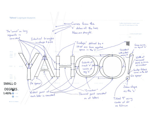
You can read all of the commentary in the discussions on the Communcation Arts group on LinkedIn.
After when a moment, pupils have been obliged to complete everything themselves. https://eliteessaywriters.com/
ReplyDelete